I recently worked on a Website Blueprint project for my client, Crystal. She’s a coach, consultant, and strategist for leaders and brands through an inclusivity lens. Her work is deep and powerful… but her website wasn’t doing it justice.
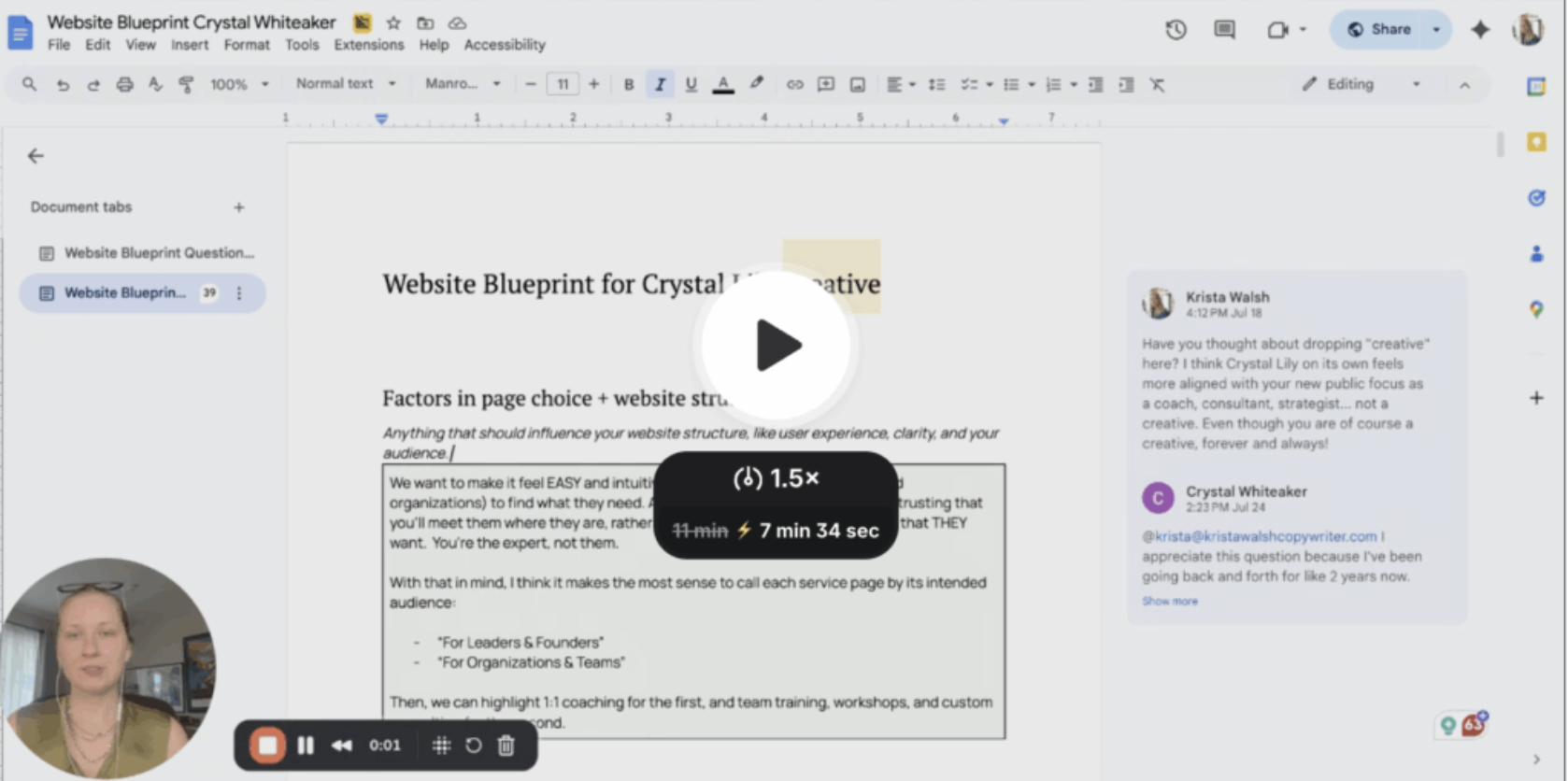
I created a video walkthrough on exactly how we are restructuring her site to support her business strategy, elevate her messaging, and create a better experience for her potential clients.
Click the image to watch below ↓
But for those who want to read, not watch (entrepreneurs after my own heart!), here’s a written recap:
The starting place:
Crystal’s current site has a lot going on. The “Solutions” tab alone has an overwhelming number of services. That’s because Crystal offers a wide range of support — for individuals, teams, and organizations — and it all ended up in the navigation with no clear pathway through.
This is really common because, as our business evolves, we update our website piecemeal, one landing page at a time. Until we have, uh, kinda a mess.
So our first step was to ask:
“Which services need to be front and center, and which can be background offers for existing clients only?”
This was not about forcing Crystal to choose a single niche. Instead, it was about thinking strategically about how people enter her business. Your website is the front door, so it needs to guide the right people through, not overwhelm them with every possible path.
We identified three core service areas that serve as the true entry points into her business:
- 1:1 Coaching
- Team Training & Workshops
- Custom Consulting
These form the foundation for everything else she offers.
Services like brand photography and wellness retreats are now reserved for clients who’ve already done the foundational work. These offers are still available, but they’re no longer emphasized on the main site.
Next: we streamlined the website structure.With a clearer focus, we shifted to restructuring the website pages. Instead of organizing by service, we reorganized by audience. This was a HUGE shift.
Instead of a massive dropdown of service names, we now have just two clear entry points:
- For Leaders and Founders (individuals)
- For Organizations and Teams (group-focused)
This way, visitors can quickly self-identify and access the services meant for them … without needing to understand the ins and outs of Crystal’s full service suite.
We also designated several pages as lower priority. These are still accessible (usually via the footer), but they no longer clutter the main navigation:
- Brand Photography — available to past clients via direct link
- Retreats — removed from the main nav but still offered behind the scenes
- Resources — consolidated into one hub page (instead of scattered landing pages)
And some pages were cut altogether:
- Media — content moved under the new “Speaking” page
- Praise — rebranded as “Case Studies” to better reflect the depth of the content
- Solutions — no longer needed since we’ve restructured the site around audience
The result is a simpler, more intuitive main navigation, one that guides potential clients on how to interact with Crystal’s business. The footer houses all other pages that need to be accessible but aren’t central to the sales journey.
Then: we added strategic calls to action
We mapped out two key CTAs:
- Transitional call to action
For folks who aren’t ready to reach out but want to stay connected. This might link to her book or another soft entry point — like a free resource — depending on what she wants to prioritize.
- Inquiry form with qualifying questions
Because Crystal’s work is high-touch and often custom, we updated her inquiry form to include:
- Identity-based questions (e.g., “Which best describes you?” instead of “Which service are you interested in?”) to make it easier for potential clients to choose
- Timing questions (“What makes now the right time?”) to get a sense if a potential client is ready or not
- Budget range questions to gently qualify inquiries
- Identity-based questions (e.g., “Which best describes you?” instead of “Which service are you interested in?”) to make it easier for potential clients to choose
Finally: we looked at her messaging
I looked at her gaps and proposed messaging shifts to close those gaps.
1. Clarify her audience
Right now, her site says she works with “conscious brands and leaders” — which could mean anything from solo entrepreneurs to massive enterprises. We want her copy to make it obvious who she’s for and who she’s not, so the right people feel seen and the wrong ones can self-select out.
2. Shift from “We” to “I”
Crystal used to have a team-based model, so her site used “we” language. But now, she is the one doing the strategy, the facilitation, and the client work. So we’re making a shift to own that and having Crystal speak directly to her audience in her own voice.
3. Highlight her differentiators
This might be the most important shift (!!). Her unique approach wasn’t coming through.
Crystal doesn’t just offer inclusive brand strategy. She starts at the root with personal values and builds outward from there. Her process flows from internal clarity to external alignment, which is rare and incredibly powerful. So we’re repositioning everything to center that idea and bring her full philosophy to the forefront.
***
If you’ve made it this far, you’ve seen how much clarity and direction a Website Blueprint brings, not only to a site, but to a whole business strategy. It’s a clean, aligned plan for what your site should do, say, and prioritize. (And I can’t wait to share the final results!)
If you want this kind of clarity for your own business … whether you’re writing your site yourself or planning to hire help … this is exactly what my Website Blueprint offer is for.
xoxo, your favorite website freak,
Krista
P.S. Special thanks to Crystal for allowing me to pull back the curtain of our ongoing project. If you’re looking for an incredible 1:1 mentor or workshop facilitator as you build inclusivity into your business, connect with her!
the loom video is not working. its not playing
Just added the link back in — thank you! Should be working now.